While LinkedIn celebrates its 18th birthday on May 5, few people realize that LinkedIn was launched nine months before Facebook launched at Harvard – making it one of the oldest social networks still in use today.
- With 55 million companies as members, LinkedIn is clearly a driving force in the economy as evidenced by 61 million “senior-level influencers.” Thirty-three percent of B2B decision makers use LinkedIn to research purchases. From a talent or recruiting perspective, three people are hired through LinkedIn every minute, and LinkedIn has 15 times more content impressions than job postings.1
With this kind of influence, one might think individual and company LinkedIn profiles are given top priority and designed to stand out. Unfortunately, this is not the case.
Within the B2B marketing arena, we see common oversights regarding the profile picture, headline, and background photo.
Fix #1: Use a professional headshot for your LinkedIn profile.
Years ago, we were taught that how you dress for an interview can impact a prospective employer’s impression – right down to polishing your shoes. Well, in LinkedIn, your professional headshot is key to creating a positive first impression. Don’t underestimate its impact just because it’s 400 x 400 pixels and high resolution. Your headshot should create a good first impression, increase trustworthiness, and raise the emotional connection. Below are samples and general thoughts from a graphic design standpoint.
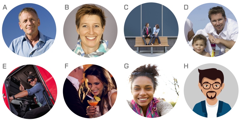
- Outdoor headshots can work just as well as studio shots. This is warm, friendly and inviting, with no distractions in the background.
- This is a great example of a professional studio headshot and smile, with no background distractions.
- Here, the subject is too far away. We can’t establish that important emotional connection.
- First impression: This is a warm and engaging photo. Understandably, family is important. However, unless your business is germane to the subject matter, steer clear of cropped vacation or family photos. We advise clients not to show children’s pictures. Save that for Facebook where you control who has access.
- While we instantly gain a sense of this person’s profession as a truck driver, the camera distance is too far away. Sunglasses are a definite no-no. Wearing sunglasses creates an air of distrust because we can’t see the person’s eyes and our immediate thought is: What are they hiding?
- This may be a great photo depicting a happy memory, but it’s too casual and inappropriate for LinkedIn.
- Another big no-no is the use of a selfie. Selfies can distort, bloat and flatten facial features.
- While caricatures capture attention because they’re different, they don’t allow us to connect with a real person.
Fix #2: Make sure your headline is specific and states what you do.
As LinkedIn has matured, the headline has become the second most important piece of real estate on LinkedIn. If you simply list your title as president of XYZ Company, the reader has no sense of what you do, what your company does, or the problems you solve. A title and company name, what does that really mean? Most every company and nonprofit organization have a person serving as president. What do you do? Lead? Develop? Mentor? Teach? Train? What are your areas of expertise? Do you have a niche market?
Which headline below creates greater clarity?
- President of Sandcastle, Inc., or
- President | Founder | Develop Artistic Talent | Train Students | Increase Sensory Perception | Experiential Growth Through Tactile Materials
Here are more strong headline examples that go beyond the title and company name:
- International Sales Trainer | Keynote Speaker | Best-Selling Author | Sales Strategist
- Visual Communicator | Storyteller | Graphic Design | Painter | Artist | Sculptor
- Chief Fixer-Upper | Electrician | Plumber | Carpenter | Residential Homes
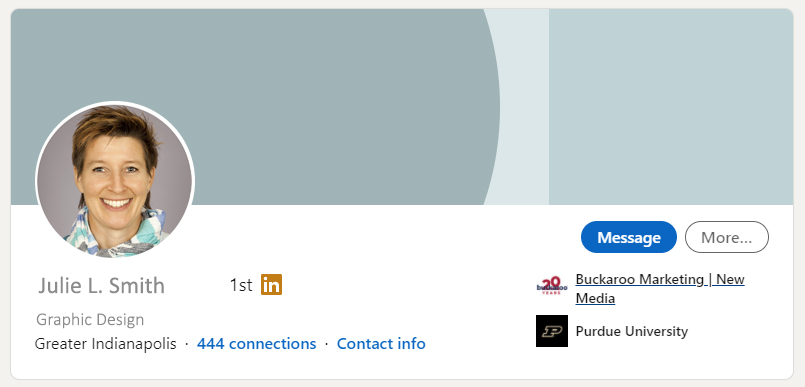
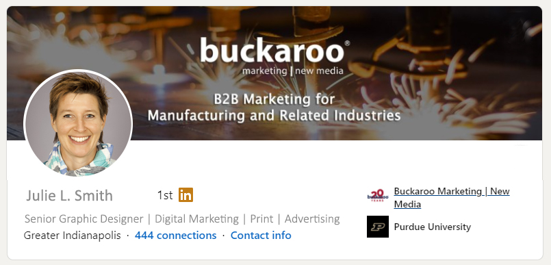
Fix #3: Make use of the background photo (also known as cover image, wallpaper, or banner).
The background photo is exactly that – a picture or design behind your profile picture. It’s a valuable piece of real estate and provides another opportunity to display a graphic related to your industry or brand (As of July 2020, the standard background size is 1584 pixels wide by 396 high, with a maximum file size of 8 MB, and the file type must be a PNG, JPEG, or GIF).
But what if you aren’t a graphic designer? You have three options.
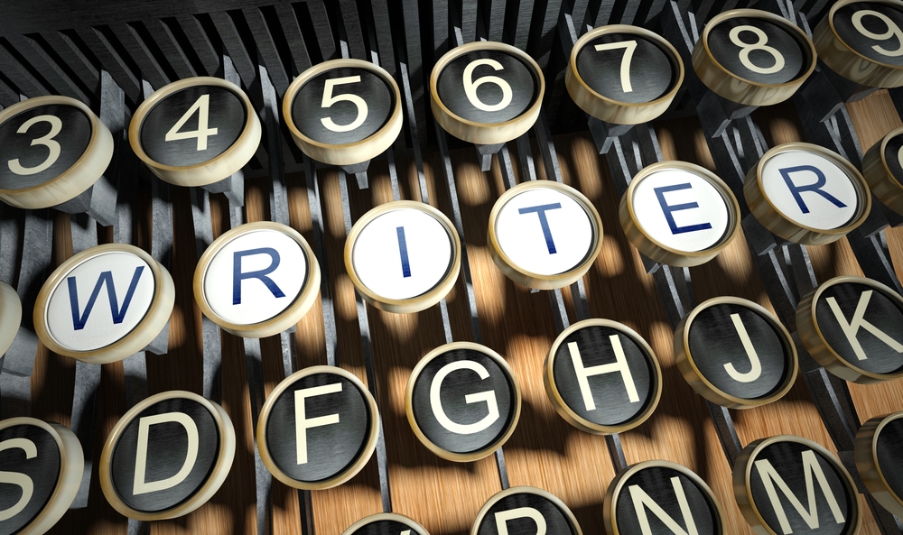
- What speaks to your personal brand? What are you passionate about? What do you love doing? We recommend you use a royalty-free, low-cost image. Once you download the image to your computer, you can then upload it via LinkedIn as your background photo. For example, one of the images below could represent an experienced writer or editor.
- For do-it-yourself, low resolution, online graphics, you can try your hand at using a simple graphic editing program like PicMonkey or PicsArt.
- Upload a company graphic or logo, which easily can be obtained from the marketing department. If you have a sales team or dealer network, be sure your message and brand are consistent on everyone’s LinkedIn profile.

Which image is more attention-grabbing?
Still not convinced it is time to spruce up your LinkedIn profile? Consider this:
- According to LinkedIn, research shows that just having a picture makes your profile 14 times more2 likely to be viewed by others. But as we discussed earlier, not all headshots are created equal. Be sure to present yourself in the best manner possible.
- Four out of five people on LinkedIn “drive business decisions.”
- 94 percent of B2B marketers use LinkedIn to distribute content.
- 57 percent of LinkedIn’s traffic is mobile.
- 40 percent of LinkedIn users change their job, company, or industry every four years.
Forty million people use LinkedIn to search for jobs each week. You, your talents and skillsets are your greatest marketable assets. Through the profile picture, headline and background photo, you can more readily create a positive impression – ultimately inviting others to connect with you.

